Metropolis sampling of quantum hall wavefunction
I thought I’d whip up a fast little script to show the radial density of the fluid from a laughlin style wavefunction.
Doing it algebraically and exactly I’ve run into some hiccups that may or may no iron out.
Using monte carlo sampling is easy enough.
Using the metropolis algorithm i suggest a new configuration of positions of the electrons, then accept or reject depending on whether a random acceptance ratio is greater that the ratio of the probabilities of the configurations (probabilities being given by the square of the wavefunction).
Then I make a histogram.
There are a ton of inefficiencies in this implementation, some that would be very very easy to fix. For example, I could put the binning in the loop. That’s save me that huge data structure and let the thing run for hours. But whatever. Works good enough for now.
import numpy as np
import matplotlib.pyplot as plt

N=10

#Now it is setup to plot filling factor style density

def Prob(x):
    prod = 1.
    for i in range(N):
        for j in range(i):
            prod = prod * ((x[i,0]-x[j,0])**2 + (x[i,1]-x[j,1])**2)**3
    return prod * np.exp(- 0.5 * np.sum(x * x))


def suggestMove(fromx):
    '''
    index = np.random.randint(N)
    newx = x
    newx = x[index] + random.randn()
    '''
    return np.random.randn(N,2) + x


def Step(x):
    xnew = suggestMove(x)
    xold = x
    acceptanceratio = Prob(xnew)/Prob(xold)
    if acceptanceratio > 1:
        xnew = xnew
    else:
        if np.random.rand() < acceptanceratio:
            xnew = xnew
        else:
            xnew = xold
    return xnew


x = np.random.randn(N,2)
steps = 100000
data = np.zeros((steps,N,2))
for step in range(steps):
    x = Step(x)
    data[step,:,:] = x

q = np.sqrt(data[:,:,0]**2 + data[:,:,1]**2)
#r = np.linspace( 0.01, 7., num = 128)
p,edges = np.histogram(q, bins=128,density=True)
edges = (edges[1:] + edges[:-1])/2

#Will get better sampling results if I move this radial factor into the probability.
#The origin is more poorly sampled just due to geometric factors. And then dividing
# by a small number amplifies this.
p = N * p / edges
#plt.hist(r,bins=128)
plt.plot(edges,p)
plt.show()
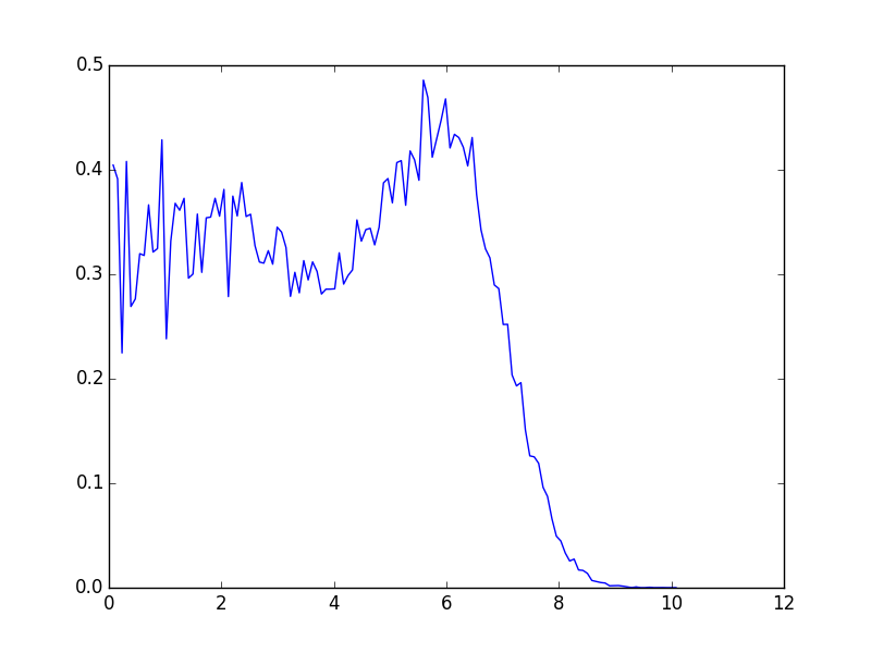
Not totally sure everything is right, but at least we are getting a filling of 1/3 for the laughlin state. So that’s something.
I believe that peak is an actual effect. I think I’ve seen it in plots before.